Friday, April 27, 2012

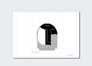
These drawings represent the Circulation of the Villa Savoye. As such Black is heavy circulation, such that it contains a path that will be used on that level. Dark Grey is a path that is commonly used and space that is used for interconnection, and finally light grey is a space of 'invitation' such that the space is only used for a specific purpose - Dining and bedroom areas and the like. 


Thursday, April 26, 2012

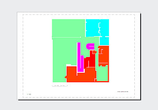
Public and Private spaces

This set of drawings explores the relation between Public and Private Space. 
Green represents public space 
Red is private spaces such as bathroom and bedrooms
Blue represents semi-private spaces, in light of the fact this is a house with live in "help" I have chosen to make the semi private spaces include all utility rooms- laundry facilities and kitchen with terrace.


This exploration was one of the morning light. I juxtaposed light spaces with darker colours. So that the roof which is bathed in sunlight appears black. 


The "beating heart" of the model at the centre of the wire ramp to scale 1:100 this also demonstrates the demonating size of the ramp in comparison with the rest of the building.


Monday, April 23, 2012


SM-SAVOYE SM-SAVOYE

On a related note as I was researching for task two I came across this. It's surprisingly apt for how I now personally feel about the Villa Savoye if a bit tongue in cheek.


Courtesy of
http://ad009cdnb.archdaily.net/wp-content/uploads/2012/03/1331645895-sm-savoye.png

Wednesday, March 21, 2012

The Plans for the Villa Savoye


Axonometric of the Villa Savoye. I tried to highlight the driveways interaction with the house as it is such a dominating feature that drives the facade looking out towards it.
Section cuts of the Villa Savoye again focusing on the circulation through the building via ramp and spiral staircase
Assorted photos of ceilings and floors removed to better illustrate Corbusier's careful delineation of internal and external spaces.


Section cuts of the Villa Savoye. We chose to concentrate of the circulation of the building as it is the ramp that forms the "heart" of this building. With this in mind a sectional cut was the best way to show Corbusier's passages through the building.